
Nobody likes a critic, but everybody seems to care what critics have to say. Since I’m desperate for you to care about my opinions, I’m giving you something you didn’t ask for (but secretly want): my critique on Sun Belt sports logos.
I’m not without credentials. I’ve endured a thirty-year career in advertising – not as a designer, admittedly, but I’ve spent a great deal of time around design. I’ve acquired expertise via sheer osmosis. I’ve kept this fact secret from art directors, who can be a touchy lot.
These observations are unranked. One man’s horrible logo is another man’s Matisse. Overall, I find Sun Belt logos to be pretty solid. My criteria isn’t especially taxing. A logo should be easy to identify on a baseball cap and should never mix fonts. That’s about it.
The Marshall mark is a Jekyll and Hyde tragedy given logo form. The “M” comes at you like bitch’n green flame – unapologetically distinguishable from a thousand paces. Then, for no reason at all, somebody adds a black censor strip through the middle and writes “The Herd” in a generic energy drink font. If you’re so desperate to brandish the Herd identity, stick with the buffalo.
Front facing animals were all the rage during the 2000s, and the Red Wolves nailed that outdated aesthetic. Easy to stamp onto a cap or golf shirt, the Howl mark does its job. Could it use a refresh? A reboot? A reimagining? Probably all three. Until the administration coughs up bucks for a rebrand, Arkansas State can roll with this mark with confidence.
There’s nothing wrong with what The Eagles are doing here. You just wish it was…something else. Georgia Southern has a wealth of branding to fall back on – the navy blue and the block numbers are just too tough, man. This logo, with the name raked forward and the stylized eagle, is a step away from Georgia Southern’s no-nonsense, hard-nosed persona.

Why is the Minnesota Metro Dome sitting atop the letters? Ha! Just busting your balls, Old Dominion. Clearly, it’s some kind of Italian-style crown. Right? Obviously, the designer who created this stripped down version of the ODU Lion logo had baseball caps in mind, but it’s lost some of its regal qualities.
Much like Georgia Southern’s mark, there’s nothing wrong with Georgia State’s panther, except it’s a little dull. Georgia State wants to identify itself with the City of Atlanta and style itself as the city’s urban campus. I wish the mark (and the mascot) reflected that attitude rather than it pluck a mascot from the high school grab bag.
Take everything I said about Georgia State and apply it hard to South Alabama, which should be embracing its Mobile identity rather than lazily going with a large cat more indigenous to the American southwest than to the Gulf of Mexico. Not helping is all that white space, which means it gets more lost with every retreating step. Listen, South Alabama, you got a big ass battle ship parked in your yard. How about The South Alabama Armada? Find me on Venmo.

I see plenty of love for the Bobcat, but all I see is a bottle opener. It probably looks terrific on a black golf shirt, though. And while Bobcats isn’t exactly the most memorable mascot, at least it’s an animal germane to region.

Teal is very 1990s, but don’t tell that to the Chanticleers. They’ve embraced teal like a 1997 Ford Taurus. Despite the hue, Coastal has done a fine job making a chicken look bad ass – teeth and a beak? Please bring me a bucket to pick up the chunks, as my mind is blown. Add that to the wing curled into a fist, and you might have the best mark in the Sun Belt.
The second cousin to the Marshall mark, the Appalachian State logo goes hard with the gold and black “A” only to diminish its power by adding the script “Mountaineers” to the middle. Just roll with the “A”, Appalachian State. Yosef and his pipe brings all the Mountaineers energy you need. Be confident in yourselves, just this one time.
Like Old Dominion, James Madison has a more elaborate version of this logo with an animal (bull dog) wearing a crown. Personally, I like that logo much better than the letters ranked forward, as if James Madison is plunging headfirst into the future. You’re named after a Founding Father, for God’s sake. Still, you can’t go too wrong with a meaty font and a combination of gold and purple. Just bring back the dog, man. People like dogs. People hate letters.

Honestly, Louisiana has one of the most unique monikers in all of college sports. And I goddam love the chili pepper, even if it’s subconsciously humming the Baby Back Baby Back Baby Back Ribs song. It’s it a lot of letters? Yeah, kinda. Is there anything you can do about it? Nope.
Hear me out: take a page from Coastal and replace the eagle’s scowl with some gritted teeth. Just do it and Venmo me later.

Troy had the most perfect mark in all of college football …and they tossed it away. Why you gotta do that to Hector? Just to piss me off, Troy asked a designer who spent a fair amount of time watching Forged In Fire to come up with a “T” that resembled a Roman short sword, and he nailed it. Cute! It has all the charm of a finger nail file. What I’m trying to say is bring back Hector, cowards.
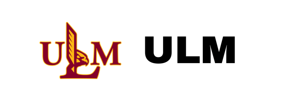
What happens when you savagely break a bird wing so that it points straight up? You got half an “L” and PETA on your ass. The subtleties of form and function have not escaped the Warhawks. In recent years, ULM has created marks incorporating the Warhawk P-40 WWII fighter plane, and I say just go with that, bruh, because twisting birds into unnatural shapes makes me sick to the gut.
Image Credit: None. I give zero credits.

